GA4 will tell you a report is "based on 100% of available data" while fifty thousand of your pages sit folded into a single row called (other). Both things are true at the same time. Available is carrying the weight in that sentence, and Google's own data quality page lists exactly three states the icon can be in. A roll-up isn't one of them.
Ask whether GA4 is accurate and every answer you get is about collection. Safari and Brave block the tag, consent banners cut the rest, and the published estimates for how much never arrives run from 10% to 30% depending on who is counting. That's real, and it's the gap you're looking at when GA4 and your store admin disagree on revenue. It's also not checkable from inside GA4, which is why every article about it ends in a shrug.
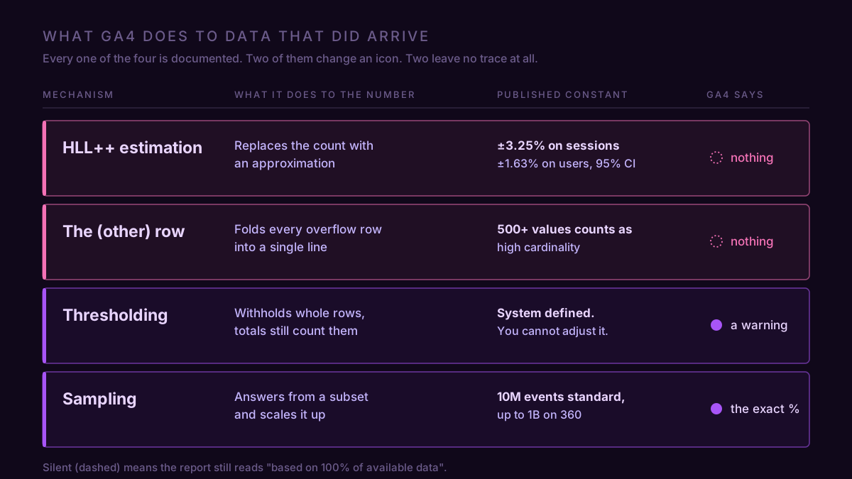
The other half is checkable, and nobody writes about it. Four things GA4 does to the data that did arrive, all documented by Google, all with published constants: your session count is good to about ±3.25%, and your page report may be missing rows outright. Two of the four change the icon at the top of the report. Two leave it reading 100%.
Sessions and users were never counted
Counting distinct things is expensive, so GA4 doesn't. It runs HyperLogLog++, an approximation algorithm, over a compact sketch of the data instead. Google's developer blog states the precision values outright: 14 for Active Users and Total Users, 12 for Sessions. And BigQuery, which uses the same implementation, publishes what each precision level costs you.
| Metric | Precision | 65% CI | 95% CI | 99% CI |
|---|---|---|---|---|
| Active users, total users | 14 | ±0.81% | ±1.63% | ±2.44% |
| Sessions | 12 | ±1.63% | ±3.25% | ±4.88% |
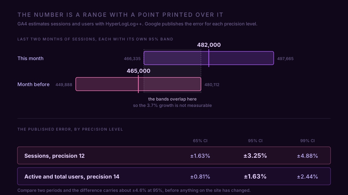
So a property reporting 482,000 sessions is telling you the real figure is between 466,300 and 497,700, nineteen times out of twenty. The 128,400 users next to it sit between 126,300 and 130,500. This is not a bug and not something you can configure away. It's the same number in the interface, in Explore, and through the Data API, because all three read the same sketch. And the error is relative, so it doesn't shrink as you grow: a property doing 4.8 million sessions a month carries the same ±3.25%, which is ±156,000 sessions.
Event counts and revenue work differently. Nothing has to be de-duplicated to add up purchases, so those are sums and they're exact. Which puts you in the odd position of having an exact numerator sitting on an estimated denominator every time you quote a conversion rate.
Now compare two periods. Each session figure carries its own ±3.25%, and if you treat the two errors as independent the difference carries about 4.6%. That's the number worth writing on the wall: a move in sessions smaller than about 4.6% between any two periods is inside the estimator's own noise, before you've considered seasonality, bots, or anything that happened on the site. Most of the traffic wobbles people investigate on a Monday morning live in there.
The (other) row is a roll-up, and the report still says 100%
Every GA4 table has a row limit. When the number of unique dimension combinations exceeds it, the overflow doesn't get dropped and it doesn't get sampled. It gets glued into one row labelled (other). Google's own example: a Pages and screens report with a 100,000-row limit against a property with 150,000 unique pages leaves 50,000 pages condensed into that single row.
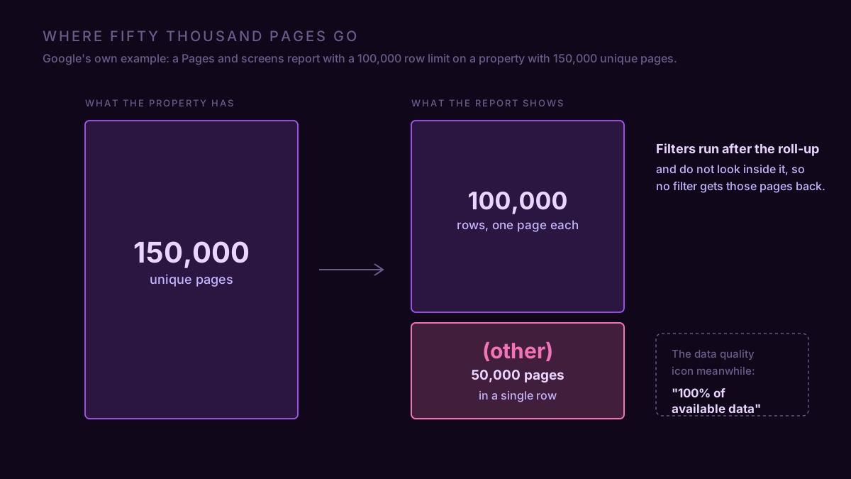
Two details do most of the damage. The first is that filters are applied after the aggregation, and they don't look inside (other), so you can't filter your way back to a page that's already in there. The second is that the row limit isn't a published constant. Google calls 500 unique values per day a guidance figure for what counts as high-cardinality, then says the actual table limit varies by property type, by report, and by query complexity. You find out you crossed it by seeing the row.
This is the one that produces phantom findings. A page path that looks like it collapsed to zero usually got absorbed, which is why an (other) row that swelled is worth ruling out before you go hunting a traffic drop. It shows up in reports, in explorations, and in Data API responses alike, and the usual cause is a custom dimension quietly carrying something unique per user: a full URL with query strings, a timestamp, a session ID, an order number.
Checking costs a minute. Reports → Engagement → Pages and screens, sort by views ascending, and look for the row. If it's there, everything you've read off that table was a top-N list wearing the clothes of a full one.
Thresholding deletes the row rather than shrinking it
If a row covers too few users, GA4 withholds it. Not a smaller number, no number. The rows simply aren't there, and the totals above them still include the traffic, so a table can fail to add up to its own header.
It fires when Google signals is part of your reporting identity and the report touches demographics, interests, or search terms, and it hits low-traffic properties and narrow date ranges hardest. Google is blunt that the levels aren't yours to set: "Data thresholds are system defined. You can't adjust them." What you can change is the trigger. Admin → Data display → Reporting identity, switch it to Device-based, run the report again. If the blanks fill in, it was signals, and you now choose between seeing those rows and keeping the cross-device stitching. Dropping age, gender and interest dimensions from the report does the same job without touching the setting.
This one does get flagged, in wording worth reading twice: "Google Analytics has applied thresholding to one or more cards in this report and will only display the data in the cards when the data meets the minimum aggregation thresholds." One or more cards. Which ones, it won't say. Slice a funnel by device and region and the smaller segments come back blank rather than zero, and blank is not a finding about those segments.
It gets worse once a machine reads it. GA4's own Ask Advisor summarizes thresholded output without mentioning that it was thresholded, and confidently explains a gap that is a privacy floor rather than a fact about your customers.
Sampling is the one everyone worries about and the one you'll meet last
Sampling kicks in when a query needs more events than your property's quota allows: 10 million on a standard property, an initial 100 million on 360, up to a billion if you ask Explore for more detailed results. Past that GA4 answers from a subset and scales up, and the interface tells you exactly how thin the subset was. The example in Google's own documentation reads "This report is based on 8.88% of available data."
Google puts reports, explorations and API requests under the same quota, but in practice you'll meet it in Explore, on long date ranges, on properties with real volume. Shrinking the window is the fix, and it's the reason a twelve-month funnel and four quarterly funnels can disagree on the same property. Sampling is also the least dangerous of the four, because it's the only one that announces its own size.
What a real diagnosis looked like
Outdoor gear retailer, 482,000 sessions last month against 465,000 the month before, 6,140 purchases against 6,090. Conversion rate 1.274% against 1.310%. The brief was "find the 0.036 points."
There was nothing to find. Purchases are exact, sessions carry ±3.25%, and the period-over-period comparison of a rate built on them carries about 4.6%. A 2.7% relative dip in the rate is inside that. So is the 3.7% traffic growth they had been pleased about. Two months of GA4 sessions on this property cannot distinguish 465,000 from 482,000 with any confidence, and the honest answer was to stop looking and set a threshold: nothing under 5% gets investigated on this metric.
The actual problems turned up in the same hour, in the reports nobody had questioned. The landing page table had 41% of sessions in (other), because a GTM variable was writing the full URL with UTM parameters into a custom dimension, so per-page analysis on that property had been fiction for months. And the device-by-region breakdown returned three empty rows out of eight, which was thresholding on Google signals, not three regions with no traffic.
One number that didn't move, two reports that had been lying quietly since somebody edited a tag in March.
The API says which one fired
Here's the part almost nobody uses. In the interface, two of the four collapse to a small icon on a card you have to notice and hover, and the other two never surface at all. Through the Data API, every single response carries the answer as structured fields: samplingMetadatas gives the percentage of events the report ran on, subjectToThresholding says whether rows were withheld, dataLossFromOtherRow says whether a roll-up ate part of your table.
Two booleans and a percentage, on every response, machine-readable. If a dashboard has never once told you a number was thresholded, it is reading the rows and dropping the metadata, which is how a tile ends up stating with total confidence something GA4 itself was hedging about.
We built ConvRadar as a hosted GA4 MCP server partly because of this: it reads the property live from inside Claude or ChatGPT, and when GA4 hands back an (other) row in the event catalog it marks that analysis degraded rather than reporting the roll-up as fact, and alerts on a cardinality spike when a tag change starts shredding a dimension. The prompt worth having in your pocket, once GA4 is connected: "Pull sessions and purchases for the last 30 days against the previous 30. Give me the conversion rate for both, and tell me whether the change is larger than the 4.6% period-over-period band on GA4's session estimate." The same arithmetic is worth carrying into any benchmark you compare yourself against, because every one of those was built on somebody else's estimates too.
None of the four means GA4 is broken. It means the number in the box is a range with a point estimate printed over it, and the interface only shows you two of the four reasons why. Before you go looking for what caused a 2% move, check whether GA4 is even claiming there was one.