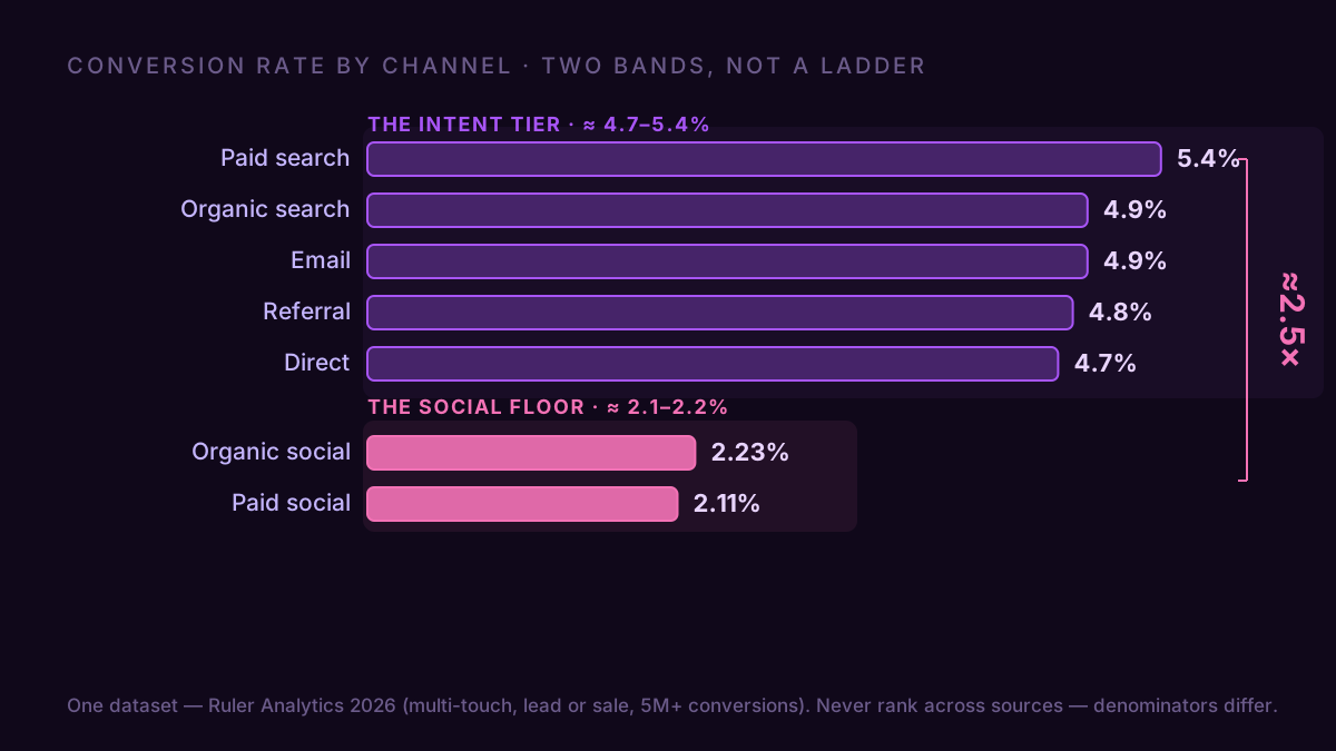
Channels don't spread across a gentle slope. They fall into two bands. In Ruler Analytics' 2026 dataset (5 million-plus conversions, multi-touch), search, email, direct and referral all convert around 4.7–5.4%. Paid and organic social sit near 2%. That's a ~2.5× gap with almost nothing in the middle, and it means your single "site conversion rate" is mostly a readout of which band your traffic came from.
You already know a blended number hides the mix — that's true on the device axis and the visitor-recency axis too. So I'll skip re-proving it. The useful part of "conversion rate by channel" is the part nobody tells you: even after you split by channel, the numbers lie to you twice. Once because you compared two sources that were never measuring the same thing, and once because GA4 quietly folds your best-looking channel into an average that isn't real.
The bands, from one dataset
Here's the table, from a single source so the numbers actually line up: Ruler Analytics 2026, all industries, multi-touch attribution, conversions defined as a qualified lead or sale. One channel is pulled out of it — AI referral, which actually converts highest of all at 5.8%, but it's a brand-new source with its own behaviour, so it gets its own analysis.
| Channel | Conversion rate |
|---|---|
| Paid search | 5.4% |
| Organic search | 4.9% |
| 4.9% | |
| Referral | 4.8% |
| Direct | 4.7% |
| the social floor | |
| Organic social | 2.23% |
| Paid social | 2.11% |
If the top of that table looks upside-down next to numbers you've seen elsewhere, that's not an error; it's the first trap, two sections down. For now, don't read a ranking inside that top band. Paid search, organic, email, referral and direct sit inside seven tenths of a point — that's attribution noise, not a leaderboard, and "email is always number one" is a myth the data doesn't support here. The real, repeatable finding is the two tiers: high-intent channels near 5%, social near 2%. Social is where people are scrolling, not shopping, so it fills the top of the funnel and converts like it. The split opens long before checkout: paid social engages at 42.62% against paid shopping's 72.50%, so the intent gap is already visible on arrival.
The floor is the part that survives every dataset: paid social sits at or near the bottom in Ruler, in Contentsquare's session-to-sale panel, and in First Page Sage's lead-gen data alike. The order above it scrambles by source — First Page Sage's last-click numbers even sink paid search toward the floor, because last-click rewards the channel that closes the sale and punishes the one that opened the visit. That's Trap One arriving a section early: the two-band gap is real, the exact ranking inside it doesn't travel.
The cross-source trap: you can't line these up
The fastest way to make a bad channel decision is to quote conversion rates from three different reports as if they were the same measurement.
Watch the same channel move. Ruler puts paid search at 5.4% (a lead or sale, multi-touch); WordStream's Google Ads benchmark puts it around 7.5% (a conversion per click, not per session). Same channel, and the two numbers can't touch each other: one counts conversions over ad clicks, the other over all sessions and folds in offline leads. Now add a blended figure with no channel split at all — Littledata's average Shopify store at 1.4% (a sale, per session) — and you've got three reports that share a word and mean three different things. Put them in one table and you've built a chart out of rumors.
So the rule for any channel benchmark is the boring one that makes benchmarks usable at all: pick one source, read what's in its denominator, and compare channels only inside it. The bands above come from one dataset for exactly that reason. And whether your own expectations should sit higher or lower depends on your model — an ecommerce store and a SaaS product read the same channel differently.
The branded-paid trap: your best-looking channel is faking it
This is the one that actually costs money, and GA4 sets it up for you by default.
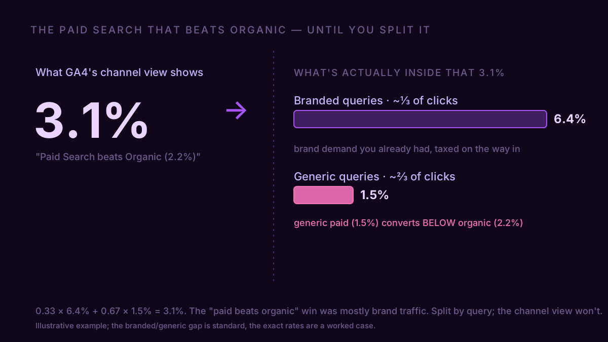
A homewares brand, call it Fernwood, opens GA4 and sees Paid Search converting at 3.1%, Organic at 2.2%. Clean story: paid wins, move budget into it. Before they do, they connect GA4 to Claude and ask one thing — split Paid Search by branded versus non-branded query. Branded: 6.4%. Generic: 1.5%. About a third of the paid clicks were people typing the brand name into Google (0.33 × 6.4% + 0.67 × 1.5% = 3.1%, so the average checks out). Those were buyers who were already coming, taxed on the way in and tagged as a paid acquisition win.
Strip the brand defense and the real comparison is generic paid search at 1.5% against organic at 2.2%. Organic wins. The "paid beats organic" call was backwards, and the money should either go the other way or into fixing generic paid's landing pages — not into scaling a number that was mostly brand demand you already had. GA4's default Paid Search channel never shows you this; it hands you the blended 3.1% and lets you draw the wrong conclusion.
Pulling your own — and the catch that trips most people
By hand, it's one report: in GA4, Reports → Acquisition → Traffic acquisition, add Session conversion rate, and the default channel grouping breaks it out. Then split Paid Search by branded versus generic yourself, because the channel view won't: filter Session campaign (or the manual term) for your brand name to pull the branded clicks out, or read your brand and non-brand campaigns separately in Google Ads. That one split is where the real paid-search number is hiding.
The catch, and it's the one that makes people benchmark themselves wrong: GA4's default is a last-touch model, while the Ruler bands above are multi-touch. Last-touch hands the whole conversion to the channel that closed it and nothing to the ones that opened the visit, so it flatters closers like email and branded paid search and starves openers like organic and paid social. Your own numbers will not sit at Ruler's levels, and the ranking can shift. Don't compare your absolute rates to the table. Compare the shape: is social your floor? Is your paid-search "win" just branded traffic? Those hold regardless of model, because that session report runs on a different attribution grain than a multi-touch benchmark and no setting reconciles them. One figure does travel, though: the gap. Social should sit roughly 2 to 2.5 times below your search-and-email band whatever model you're on. If it's much closer, that channel is punching above its weight; if it's further down, it's a leak worth a look.
The faster version skips the clicks. Connect GA4 to the AI client you already have open and ask it in one line: "conversion rate by default channel group for last quarter, then split Paid Search by branded vs non-branded — and tell me if social is my floor." It comes back in plain English against your real sessions, denominator and attribution model and all.
"Improve the conversion rate" is a sentence with no object. Name the channel, strip the brand traffic out of paid, and read the shape instead of the decimal — and the number finally points at something you can move.