Your add-to-cart rate is 4.6%. It's also 9.8%. Same store, same month, same 1,760 carts. One divides by every session. The other divides by the sessions that actually reached a product page. Almost nobody publishing an add-to-cart benchmark says which one they used, so half the stores checking themselves against these numbers are reading the wrong verdict.
This isn't pedantry about formulas. The two denominators disagree about which device is broken, which page to fix, and whether you have a problem at all.
What the published numbers actually count
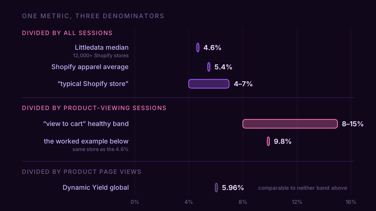
Search the benchmark and you get 4.6%, 5.96%, 5.4%, "8 to 12% is good," and "7.0 to 8.5% cross-industry." That spread looks like disagreement. Sort them by denominator and most of it evaporates.
| Published figure | What it divides by | Comparable to |
|---|---|---|
| Littledata, 4.6% average (2,800 sites, 2023) | not stated, read as all sessions | your GA4 session rate |
| Littledata fashion stores, 5.4% | not stated, read as all sessions | your GA4 session rate |
| "Typical Shopify store, 4–7%" | all sessions | your GA4 session rate |
| Dynamic Yield global, 5.96% | product page views | neither of the above |
| "Product view to add to cart, 8–15%" | product-viewing sessions | your GA4 product-view rate |
Dynamic Yield publishes its own definition and it settles the argument: "% of items added to cart after product page view(s) by visitors." That is not a session rate. It gets quoted as "the global average add-to-cart rate" in post after post, next to advice to divide your carts by your sessions. Do that and you're grading yourself against a number built on a different base. Dynamic Yield's fashion figure, month by month since 2020, is on the fashion add-to-cart rate page.
So say which one you used.
Per session: sessions with an add_to_cart ÷ all sessions. Good is 5% or better, 4–7% is the middle of the pack, under 3% is a problem.
Per product view: sessions with an add_to_cart ÷ sessions that viewed a product. Good is 10% or better, 8–15% is the middle, under 7% points at the product page.
Both describe the same stores. Whichever one you pull, the discipline is the one that applies to every benchmark: same stage, same denominator, or don't bother.
The number nobody publishes
What connects the two is the share of sessions that ever reach a product page. Call it reach.
Carts per session = carts per product-viewing session × reach. Reach runs roughly 50% to 62% depending on what you sell, the span of the table below, and that one input swings your add-to-cart rate by a factor of nearly two. Wider than any sub-vertical difference in the same table. There is no published benchmark for it, because nobody thought to measure the step before the step everyone measures.
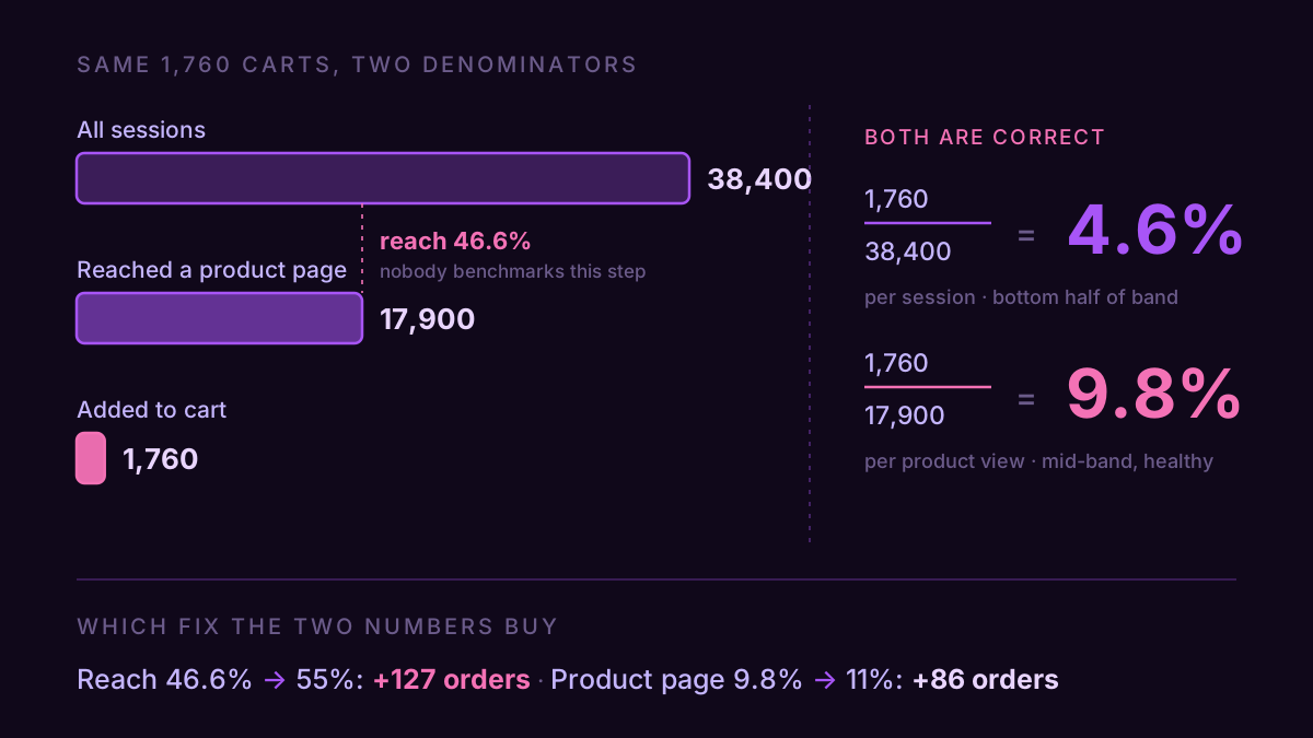
A store with a healthy product page and a broken path to it, and a store with an easy path to a bad product page, land on the same per-session add-to-cart rate. That one number can't tell them apart. Both numbers together can, instantly, and they point at opposite fixes.
The device question the denominator answers
Two 2026 datasets give opposite verdicts on which device adds to cart better. Dynamic Yield's split, on its product-view base, puts mobile at 6.19% and desktop at 5.22% — mobile ahead. The session-denominated roundups put desktop at 9.8% against mobile at 5.7% — desktop ahead by 1.7x. On Dynamic Yield's base, desktop led mobile in every year from 2020 to 2023 and mobile led in every month from January 2025 to July 2026; the mobile vs desktop add-to-cart rate by month shows where the two lines crossed.
Neither is wrong. Mobile sessions must be likelier to end before a product page ever loads, because that's the only way both figures can be true: more social traffic, more one-screen visits that never get past a category grid. Count all of those sessions and mobile looks like a hole. Filter to the people who reached a product page and mobile's disadvantage mostly disappears.
That's the practical stake. If your mobile add-to-cart rate is weak per session but fine per product view, the product page is not your problem and rewriting it will move nothing. The work is upstream: internal search that returns something useful, category pages that show price and variant without a tap, and paid traffic pointed at a product page instead of the homepage. Different fix entirely from the mobile checkout work most stores jump to.
The bands, by sub-vertical
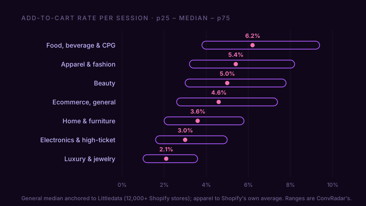
These are ConvRadar's calibrated bands. The general ecommerce median is anchored to Littledata's 4.6% average across 2,800 sites benchmarked in 2023; apparel to Littledata's 5.4% for fashion stores. The remaining medians and every range are ours, modeled from the spread across the public reports and our GA4 sample, because the published sources hand you one number and stop. The last two columns are modeled, not measured: reach is anchored to the 55% general figure and moved along the same considered-purchase gradient as the medians, and the product-view median falls out of the arithmetic above. Measure your own reach before you lean on the row.
| Sub-vertical | p25 | Median (per session) | p75 | Typical reach | Median per product view |
|---|---|---|---|---|---|
| Food, beverage & CPG | 3.8% | 6.2% | 9.4% | 62% | 10.0% |
| Apparel & fashion | 3.2% | 5.4% | 8.2% | 60% | 9.0% |
| Beauty | 3.0% | 5.0% | 7.8% | 59% | 8.5% |
| Ecommerce, general | 2.6% | 4.6% | 7.4% | 55% | 8.4% |
| Home & furniture | 2.0% | 3.6% | 5.8% | 54% | 6.7% |
| Electronics & high-ticket | 1.6% | 3.0% | 5.0% | 52% | 5.8% |
| Luxury & jewelry | 1.0% | 2.1% | 3.6% | 50% | 4.2% |
The order is the same one that runs through the purchase-rate bands, for the same reason: cheap and replenishable gets added to a cart on impulse, expensive and researched does not. Dynamic Yield's own vertical split shows a 4.4x spread between food and luxury on its base. The absolute level travels badly between datasets. The ranking travels fine.
A store where the average pointed the wrong way
An outdoor gear store, last 30 days. 38,400 sessions, 17,900 of them reaching a product page, 1,760 sessions with at least one add to cart, 2,540 add_to_cart events, 720 purchases.
| Reading | Arithmetic | Result | Verdict |
|---|---|---|---|
| Per session | 1,760 ÷ 38,400 | 4.6% | bottom half of general ecommerce |
| Per product-viewing session | 1,760 ÷ 17,900 | 9.8% | mid-band, healthy |
| Items per session | 2,540 ÷ 38,400 | 6.6% | counts items, not shoppers |
| Reach | 17,900 ÷ 38,400 | 46.6% | under the 55% general-ecommerce median |
Read only the first row and the brief writes itself: the product page is underselling, go rewrite it. Read all four and the product page is the one part working. Nine point eight is a perfectly ordinary product page. The store is losing 53% of its sessions before anyone sees a product at all.
Price the two fixes. Push reach from 46.6% up to the 55% median and hold the product page exactly as it is: 38,400 × 55% × 9.8% is 2,070 cart sessions against 1,760 today. That's 310 more carts, and at the store's 40.9% cart-to-purchase rate, 127 more orders — about $9,400 a month at a $74 order value. Now do it the other way: leave the path alone and grind the product page from 9.8% up to a strong 11%. That's 209 more carts, 86 orders, roughly $6,300.
So dragging the below-median number to median beats pushing the above-median number higher, and it's the cheaper of the two jobs. The per-session benchmark on its own would have sent you to the expensive one.
The second finding is downstream. Cart to purchase at 40.9% sits on the floor of the 40–55% band, which is a checkout question, not a cart question. Two leaks, and the product page everyone was ready to blame isn't either of them.
GA4 gives you three of these and labels none of them
There is no add-to-cart rate in GA4. There are three ways to build one, and they return different numbers.
Open Explore, build a free-form report, put Event name against the Sessions metric and filter to add_to_cart. That's sessions containing at least one cart add — the session-denominated numerator, the one that matches the 4–7% band. Do the same for view_item and you have reach, and dividing the first by the second gives the product-view rate. Two rows of one exploration, all three numbers.
The traps are the other two paths. A funnel exploration counts users, not sessions, so a funnel-built rate is a user rate and belongs to neither band. And the Events report gives you add_to_cart event count, which counts items, not people: the 2,540 above is 44% higher than the 1,760 sessions that produced it, because shoppers add more than one thing. All three are legitimate measurements. Only one is comparable to a published benchmark, and GA4 doesn't say so anywhere on the screen.
One more thing before you trust the output. add_to_cart has to be firing at all. Plenty of stores I audit have view_item and purchase with a hole in between, and a rate built on a missing event reads as a catastrophe instead of a tracking gap. And if you're checking your GA4 figure against the one in your Shopify dashboard, expect them to differ; they're counting sessions differently before either one gets to a cart.
Getting all four numbers in one pass
By hand it's the exploration above, redone monthly, with the sub-vertical band kept in a doc next to it. That works. It also means rebuilding the same two rows every month and remembering which column was which, and month three is usually where it stops happening.
The faster version puts GA4 inside the AI client that's already open. Connect it and ask for the whole set at once: "For the last 30 days, give me sessions, sessions with a view_item, sessions with an add_to_cart, and purchases. Then compute my add-to-cart rate per session and per product-viewing session, and tell me which one is below band." Four numbers, one question, answered against your real data instead of an average someone else measured on someone else's stores.
A 4.6% add-to-cart rate is a broken product page or an untouched one. The number can't tell you which, and it's the number every benchmark post hands you.